Behind the logos
With every brief there is an opportunity for design to tell the story, with research and understanding the answers always lie within the subject and design leads to that discovery.
Branding is often the first exciting step for a client’s vision becoming real. We love that challenge of finding the ‘ultimate’ solution of combining what the company does with its visual image, it’s consolidating what was previously a concept and bringing it to life.


World Boccia
The logo for the international Paralympic bowling sport of Boccia. The circle gives a global feel with the colours depicting the two teams in the game, the jack being the central white ball, the directional pattern of the balls indicate the movement and convergence of the balls during the game and the competitors coming into the event.
Branding, website, print, merchandise


Wombsong
Designed for the Chelsea & Westminster Hospital, an innovative programme of weekly singing workshops for pregnant women providing emotional, social, educational and physical benefits for pregnant women and their babies during pregnancy, labour and after birth. The logo plays on a pregnant treble clef representing mother and baby.
Branding, merchandise


Arts Council Collection
To celebrate their 75 year anniversary, we were asked to create a logo for use this year in 2021. The design wanted to compliment the existing logo yet not compete with it. The ‘75’ emulates the converging circles from the Arts Council Collection logo, and enables the logo to work independently from the main brand but still be recognisable and reference the Arts Council Collection.
Anniversary branding, guidelines


Blood Sweat & Fears
Produced to promote Hodgkin’s Lymphoma awareness campaign and encouraging discussion and conversation about the disease from all aspects, from coping with the disease to the fears people have. Each icon corresponds to the three words.
Branding, advertising


The Table Cookery School
The Table is a cookery and life skills school. The logo takes the two ‘T’s to form a table around which all the students gather to cook, to share, to learn and to eat together.
Branding, website, promotional material


HSR2020 Global Symposium
Designed for the 2020 Global Health Symposium in Dubai, the design takes influence from traditional Islamic mosaics and colours synonymous with the region. The extended and open lines of the pattern represent people from all over the globe coming together for the symposium.
Symposium branding, online annual reports, promotional material


GamMed
A UK/Gambian medical charity, the design uses the G and M of GamMed to form a monogram, the two letters follow the same circular nurturing shape and are held by a half circle or ‘smile’ below. This reflects the nature of the charity with all the elements working together cohesively and supporting each other. The 3 different elements of the logo are in the colours of the Gambian flag, red, blue and green.
Branding

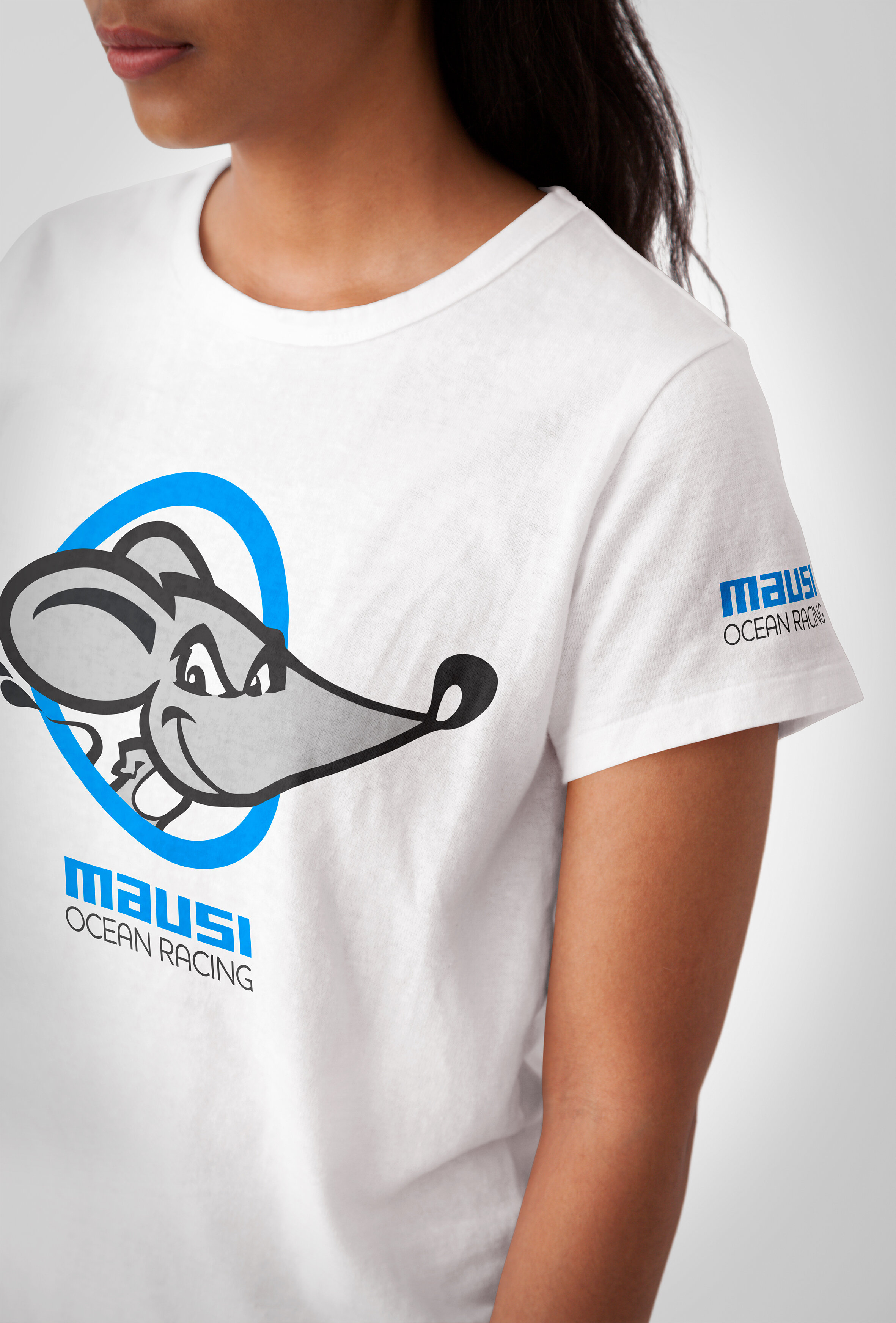
Mausi Ocean Racing
Developing a character brand for Mausi brought the name and personality of the racing yacht to life.
Branding, promotional material


Hotel School
Hotel School, an initiative developed by The Goring Hotel and supported by London’s 5 star hotel community, teaches hospitality skills to homeless and vulnerable people to help them gain employment. The shape of the shield and crown are taken from the existing Goring logo and reference the high quality of training, the central emblem is a combined ‘H’ and ‘S’.
https://www.hotelschool.org.uk
Naming, branding, website, print


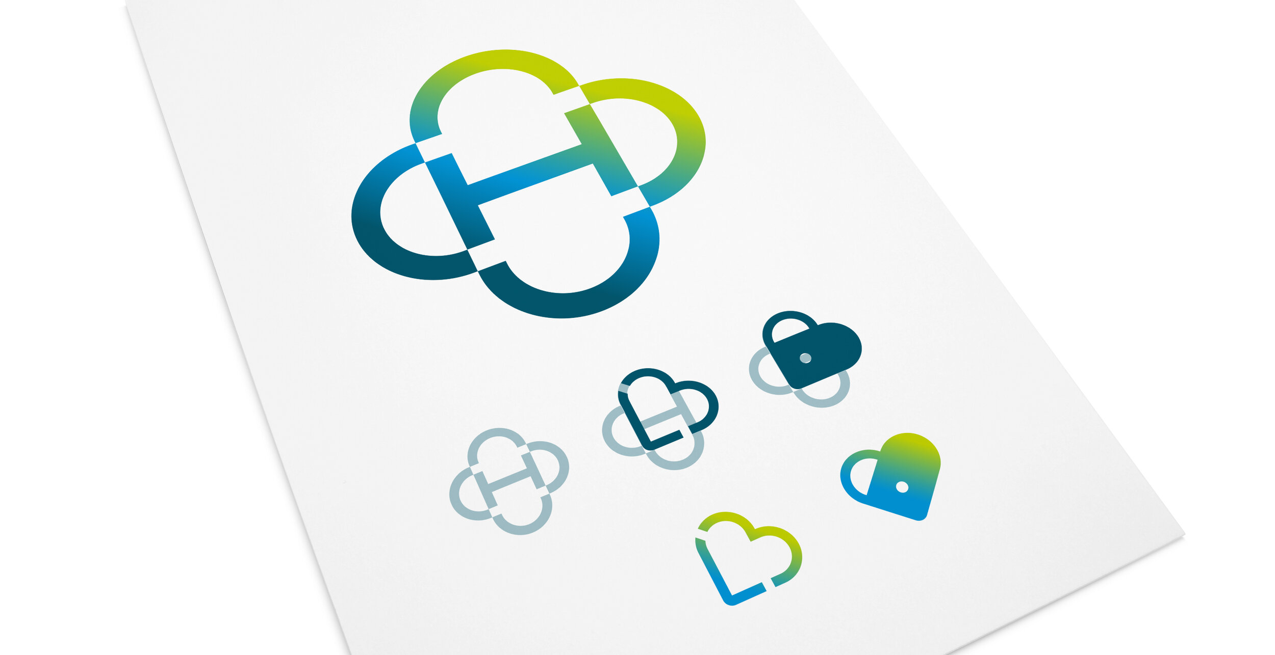
The Montefiore Hospital
The logo designed for an independent private hospital, takes inspiration from the famous crocus gardens opposite the hospital, the overlapping petals represent the different services the hospital provides. The top of the crocus forms the ‘M’ of Montefiore.
Naming, branding, external signage, wayfinding, website, print, advertising


Natterbox
A global business phone system, embedded and managed within Salesforce, from one single app. The icon represents two speech-marks coming together forming a box, emulating conversation through telecommunication.
Branding, website, print, interface design, environment graphics, advertising, event merchandise, signage


Exo-cet
We developed a character brand to reflect the speed and aerodynamics of the flying fish that Exocet the performance sail designers, are named after.
Branding, promotional material